
Creative Agenc:ReflexDesign
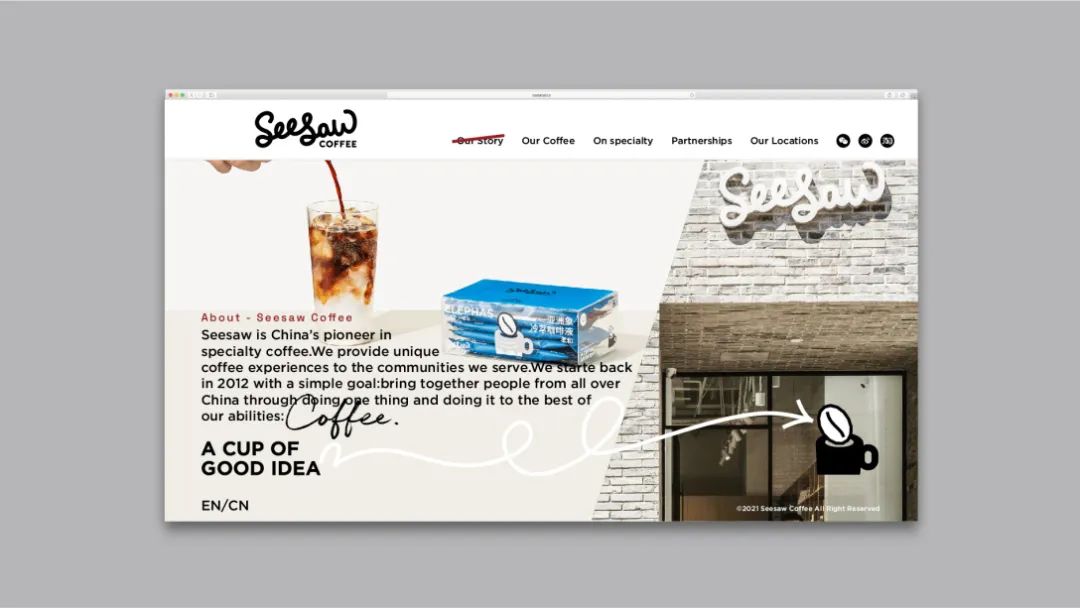
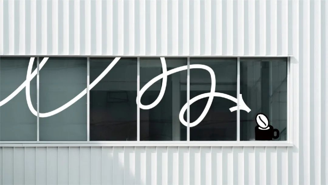
2012年创立于上海的Seesaw是国内最早的精品咖啡连锁品牌。
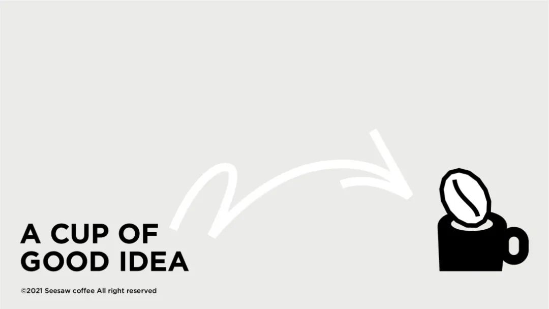
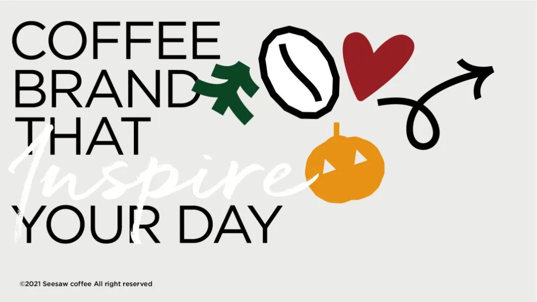
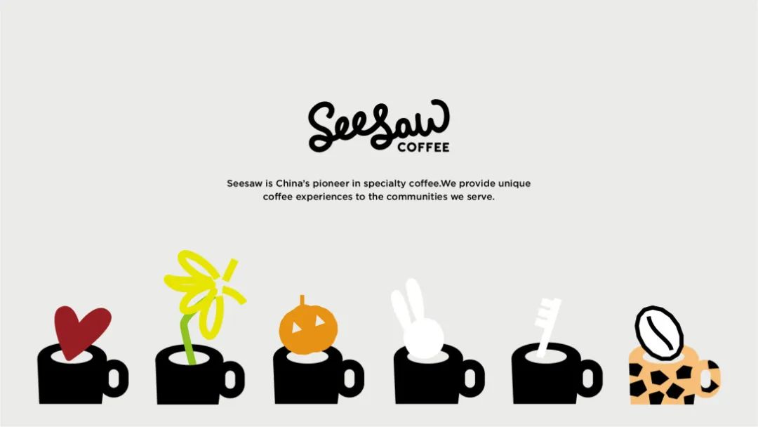
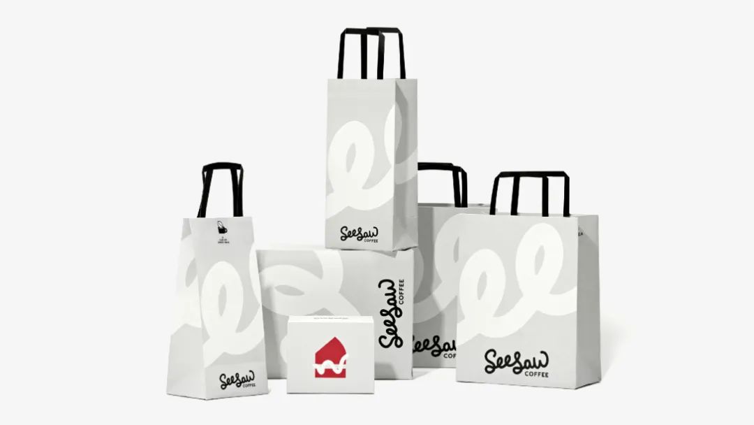
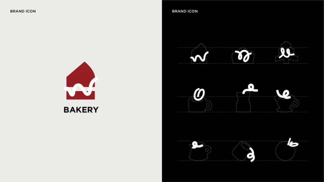
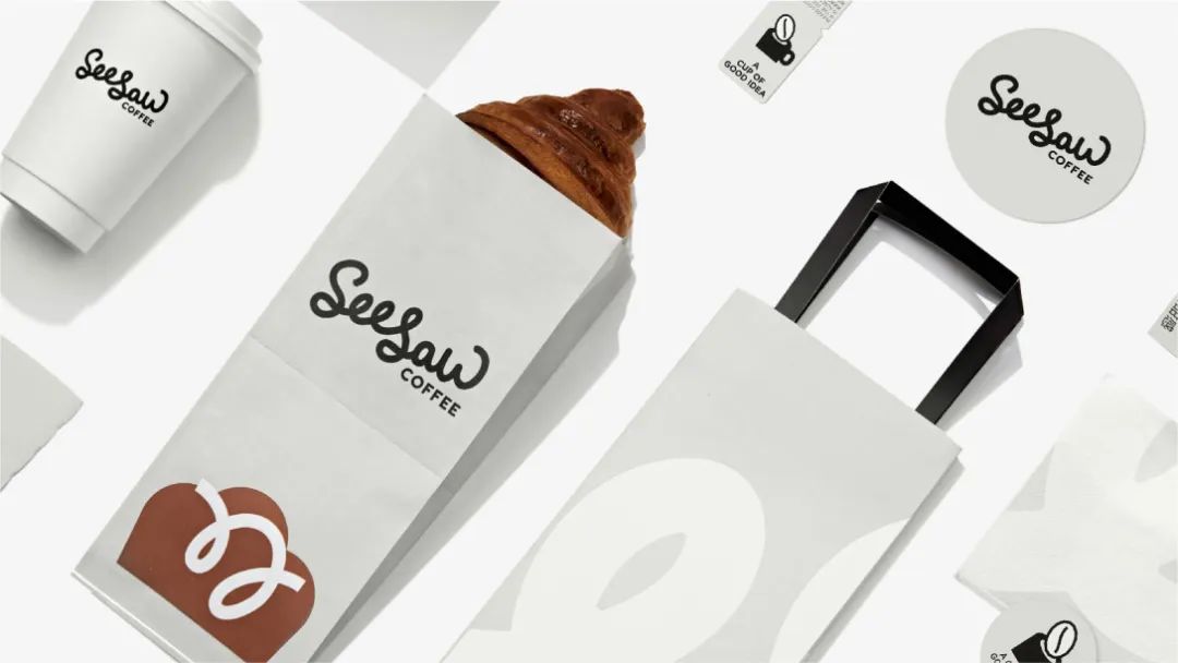
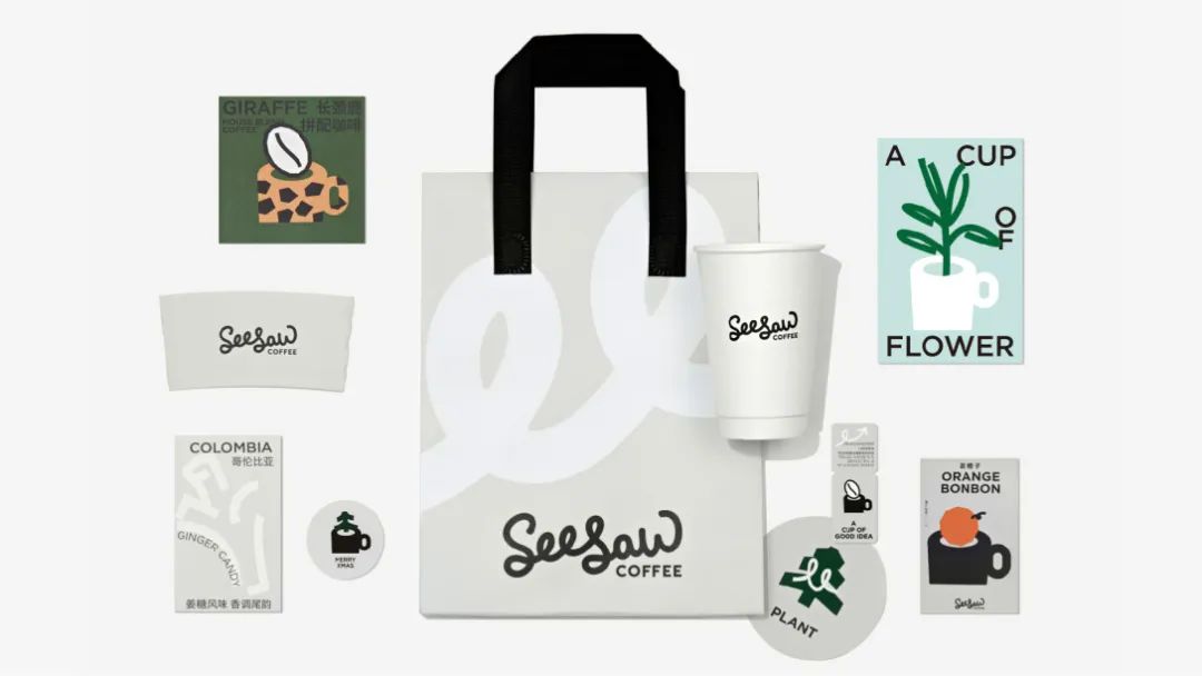
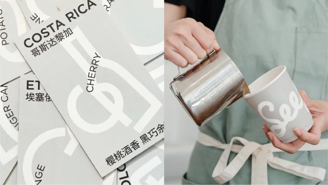
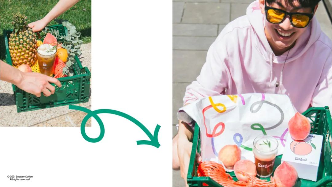
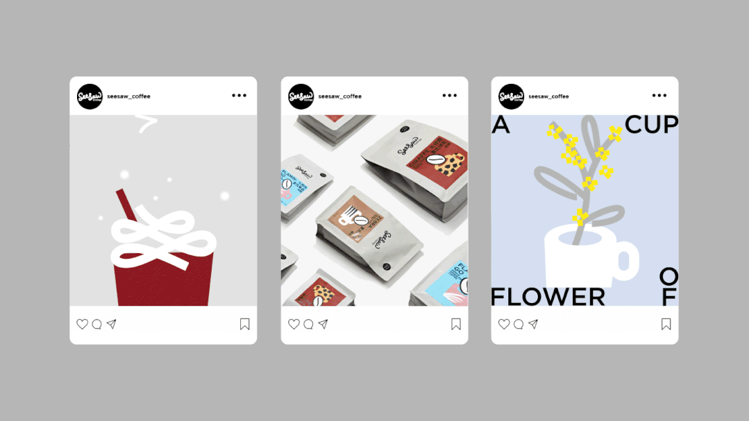
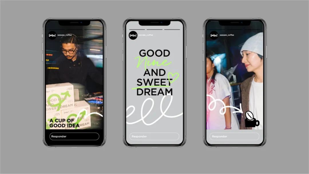
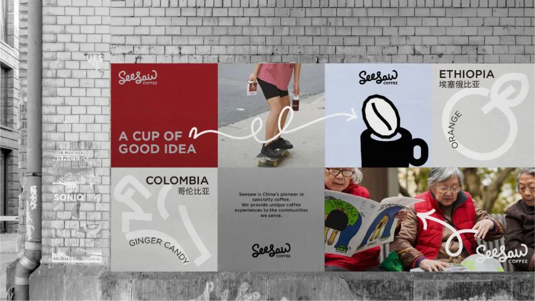
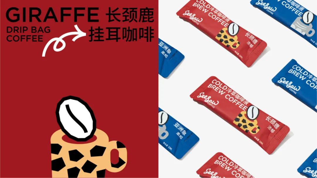
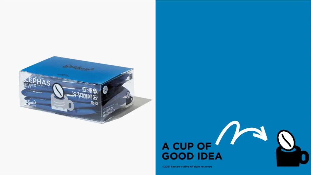
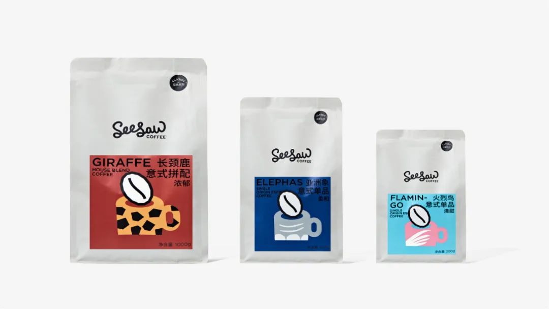
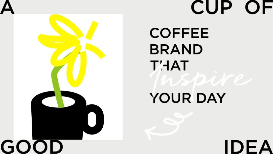
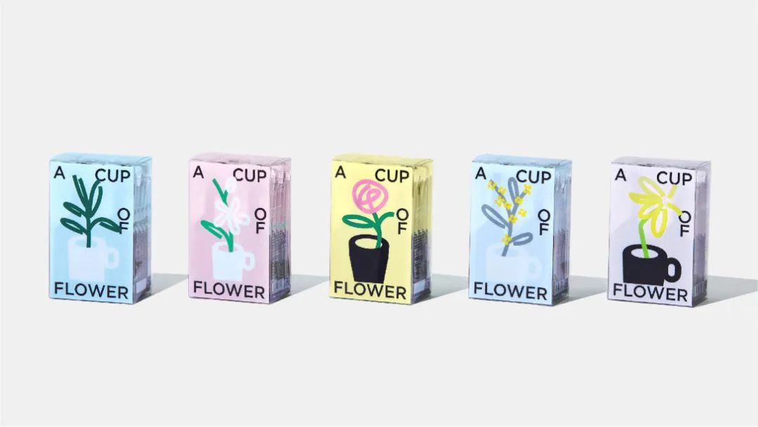
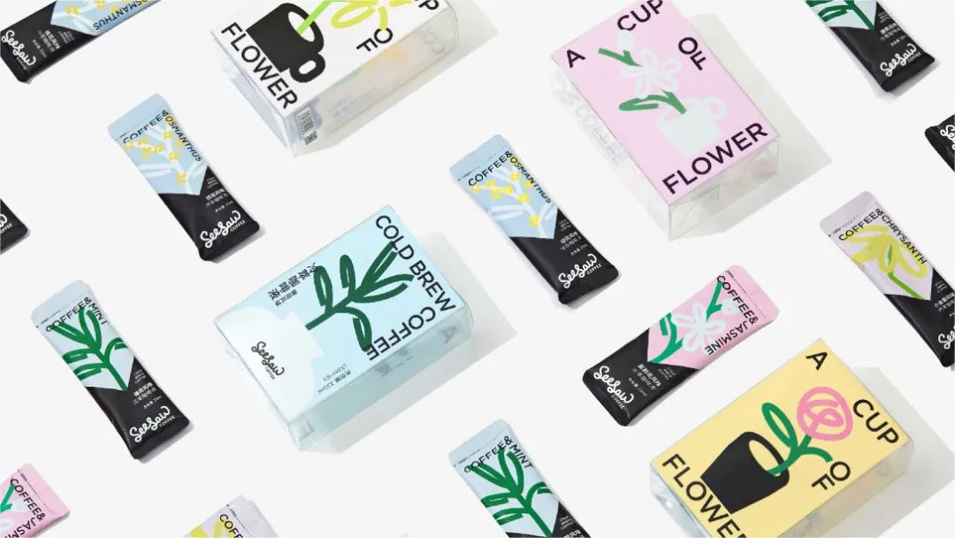
品牌重塑工作从最具代表性的标识出发,发展出一系列以“马克笔风格“线条为核心的视觉语言;同时通过挖掘 a cup of good idea的灵感主张,为品牌加入直观的咖啡杯符号,成为仅次于标识的重要识别。围绕清晰简明的视觉逻辑,我们逐步从色彩、排版、图形图像语言等多个方面做出系统规划,完成品牌在线下门店,产品包装,社交媒体及在线销售的完整呈现。最棒的一点是,这一切视觉体系的导入自然而然,契合了用户对seesaw的认知和想象。做到这些,正是因为我们倾听,洞察,并最终找到共识。
Founded in 2012 in Shanghai, Seesaw is the earliest boutique coffee chain in China.
Our rebranding work started from the most representative logo to develop a series of “marker style” line as the core of the visual language; At the same time, by exploring the inspiration of a cup of good idea, it adds intuitive coffee cup symbol to the brand, becoming an important recognition second only to the logo.
Centering on clear and concise visual logic, we have made systematic planning step by step from multiple aspects such as color, typography, graphic and image language, and completed the complete presentation of the brand in offline stores, product packaging, social media and online sales.
The best part is that the introduction of all these visual systems is natural and fits the user’s perception and imagination of seesaw. We do this because we listen, see, and ultimately find consensus.

著作权归作者所有。
